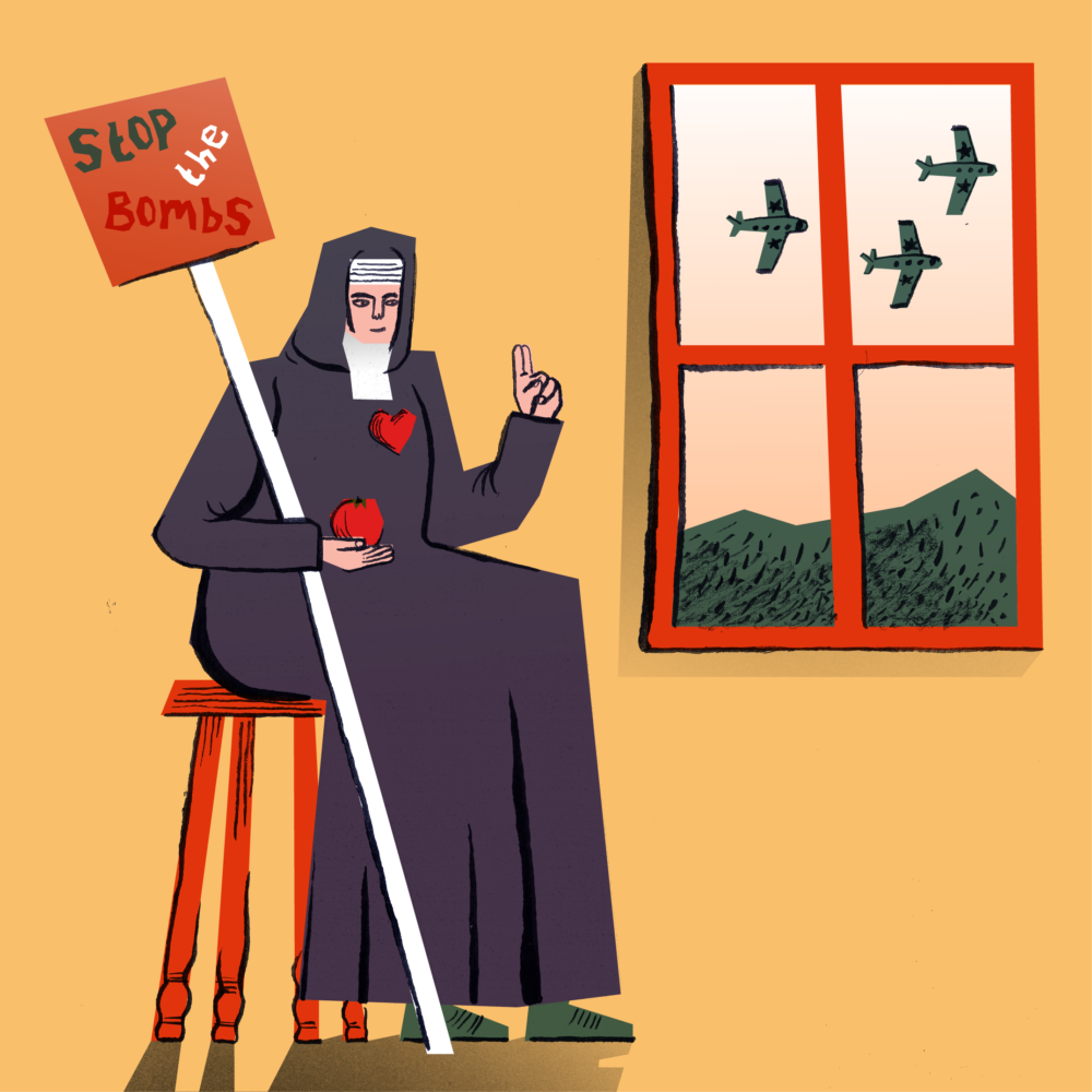
Sister Corita Kent is probably my favourite nun and definitely my favourite pop artist. For those that haven’t heard of this wonderful woman, she taught and practised art at the Immaculate Heart College in California in the ‘60s and ‘70s. She produced brightly coloured screen prints often about God and groceries.
Kent’s life and practice is filled with stuff that really resonates with the aspirations and values here at Shieldfield Art Works. She believed in a God who was Love, a Jesus who wept for humanity’s troubles, and a Mary who would have shopped at the local supermarket. Her art was as bold and boundary pushing as any, but invited the whole community to be part of it. However of most particular interest to this particular blog post is Kent’s passion for social justice, and the prints of protest that came out of it.
Much has been said about the democratic nature of print, it has a rich history from bibles to manifestos to fanzines, all of which displays an amazing power to transmit culture to the masses, and allow the masses to respond. This was a potential that Kent understood, her prints bore a message which she spread wide in her prolific career, appropriating American culture and images from the media in order to speak back to it. She was pro-peace, pro-generosity and pro-love, in a time of war, greed, and hate. Her prints were colourful, angry and ecstatic cries of defiance against injustices such as the Vietnam war, political assassinations, and institutional racism.
Protest printmaking is a tradition that is proudly carried on here at Shieldfield Art Works, and our current exhibition is one that I dare say Corita Kent might have enjoyed. The exhibition, Communities not Commodities, is made up of three groups of work, each speaking to issues of housing, community and (in)justice in Shieldfield.
Among other works Theresa Easton has contributed a set of large text- based printed posters to be placed on the outside wall of the gallery, reproducing quotes from local residents. Her works give platform and permanence to voices that have often been unlistened to, and undervalued. The black letterpress text on white background almost parody the sort of formal letters sent by landlords or the council that so greatly dictate the lives of those in insecure housing. They are a defiant response with an alternative set of values behind them.
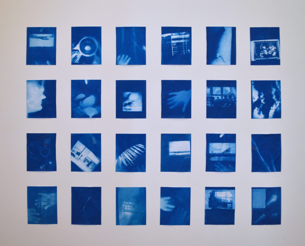
Ciara Lenihan’s set of Cyanotypes were produced in collaboration with neighbours who they’d gotten to know due to their shared troubles with an awful landlord. Both in the production process and content these interior images break down the barriers normally established by closed doors and the walls of our homes. They speak out against the dehumanising actions of those who seek to reduce communities to merely separate money making units and tell instead of the real human value of our homes.
The last group of works are a set of protest posters from the ‘70s and ‘80s around on issues of housing and feminism. Each of these has something valuable (and often witty) to say in their own right, but collectively they speak of the aforementioned tradition of protest printing which all of the work falls into. It’s a tradition full of examples of the powerful positive change, and one that we’re hoping will help change things here in Shieldfield too.
****
For a bit more info on Corita and some great example of her work, check out: http://corita.org/


